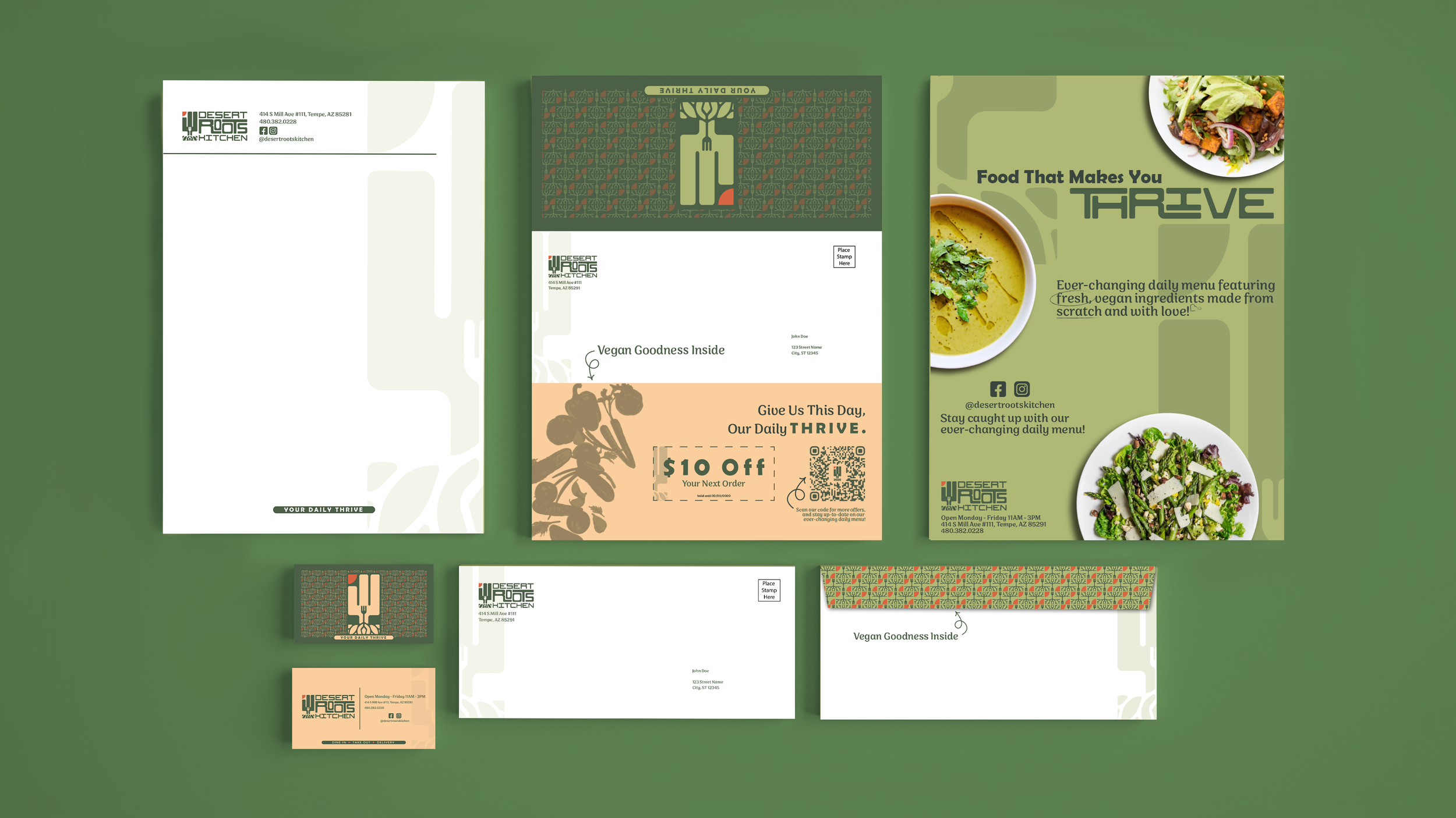
Logo + Brand Identity for a local vegan restaurant.
Client
Desert Roots Kitchen
I was drawn to Desert Roots Kitchen as they were a vegan restaurant whose menu changes daily, their food is fresh and made entirely from scratch, and they were a small business that prided themselves on being locals of the valley that shared their food with the community around them.
The Process.
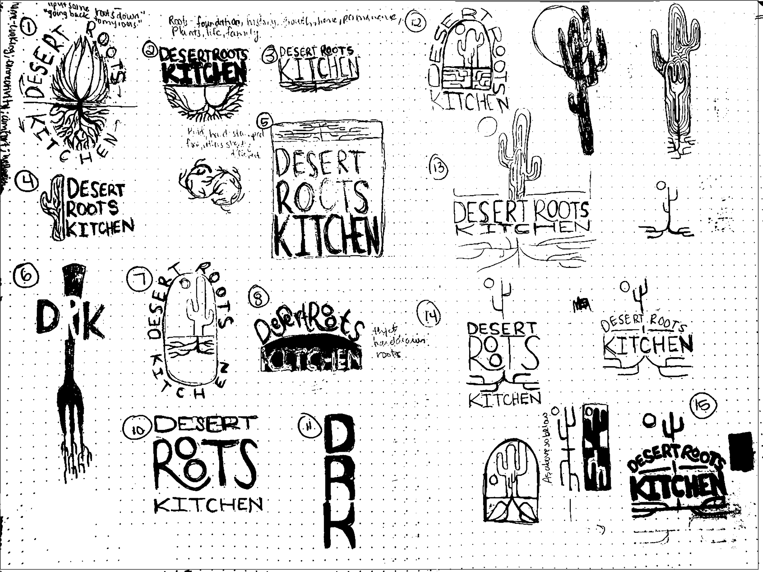
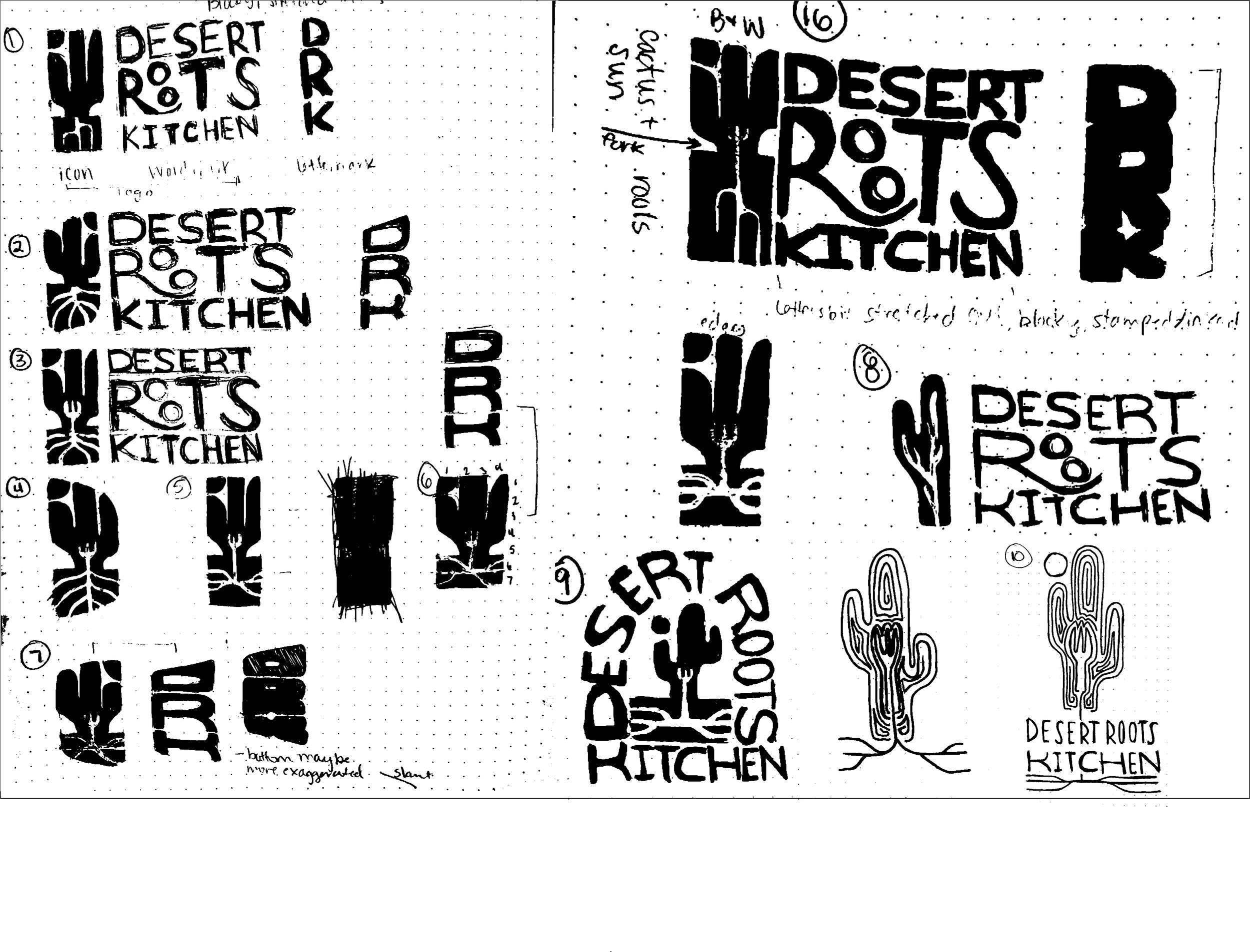
As with most projects, before I work on anything digital I try to get as many ideas down on paper as possible. The words “desert” and “roots” had a lot of strong imagery and connotations associated with them, such as warmth, foundation, history, reach, plants, life, family, etc., all of which I believe aligned with Desert Roots Kitchen’s mission.
The Product.
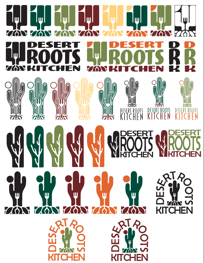
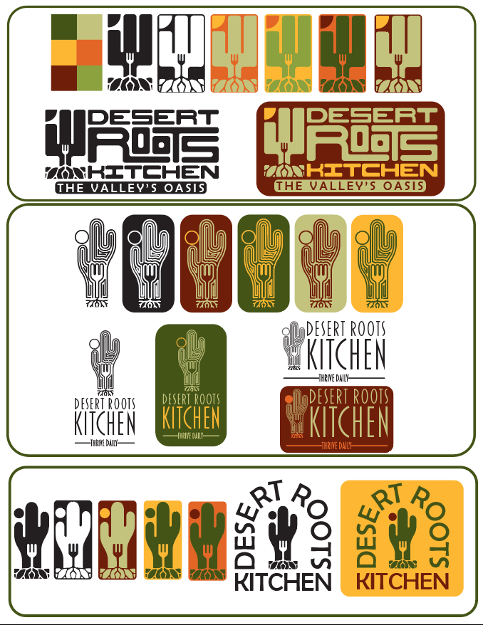
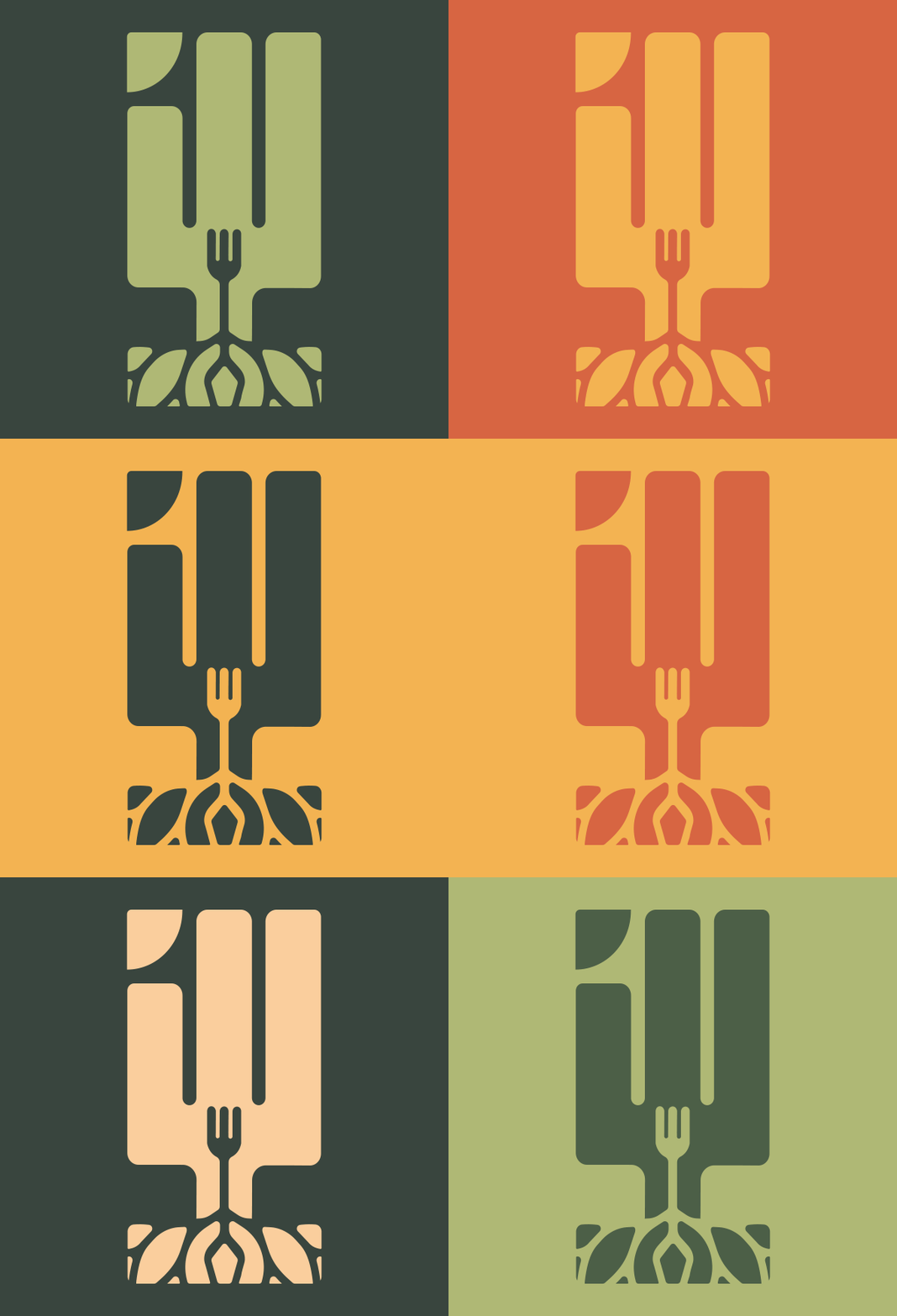
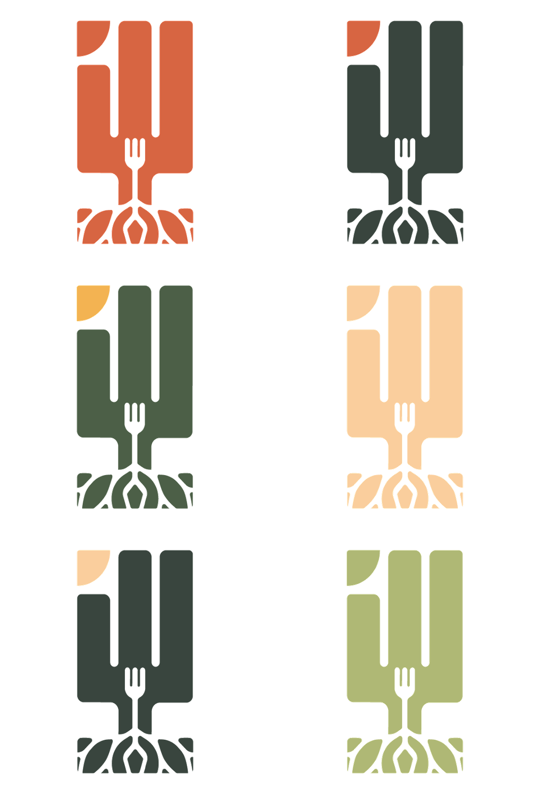
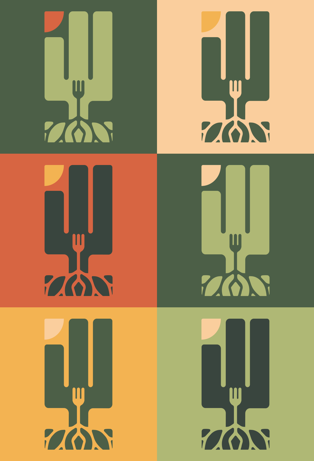
For the redesign I wanted to highlight Desert Roots Kitchen’s pride in and love for their community through the use of the iconic saguaro cactus found only in the Sonoran desert, as it stands tall and proud, reaching for the sun. The fork within the cactus is an homage to their original logo representing the Forks over Knives movement while also mirroring the form of the cactus. The roots extend from the fork, reflecting Desert Roots Kitchen extending their hands to the community around them to feed fresh food made from scratch. As above, so below. As within, so without.
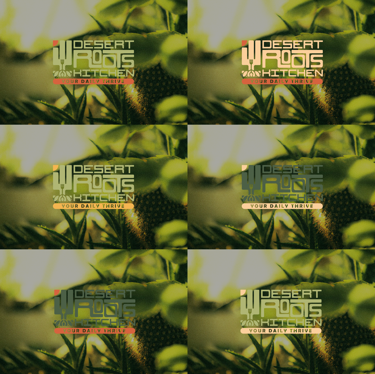
The muted yet subtly vibrant colors chosen reflect the Arizona landscape while also representing the fresh, organic ingredients used by Desert Roots Kitchen. The logo is bold, blocky, and made to look hand-stamped to communicate the approachable and organic nature of Desert Roots Kitchen and their food.
