hardcover + paperback book cover design.
This is a concept book cover redesign for The Hunger Games by Suzanne Collins, both hardcover and paperback. The concept for the hardcover is to focus on typography while the paperback is to focus on illustration.
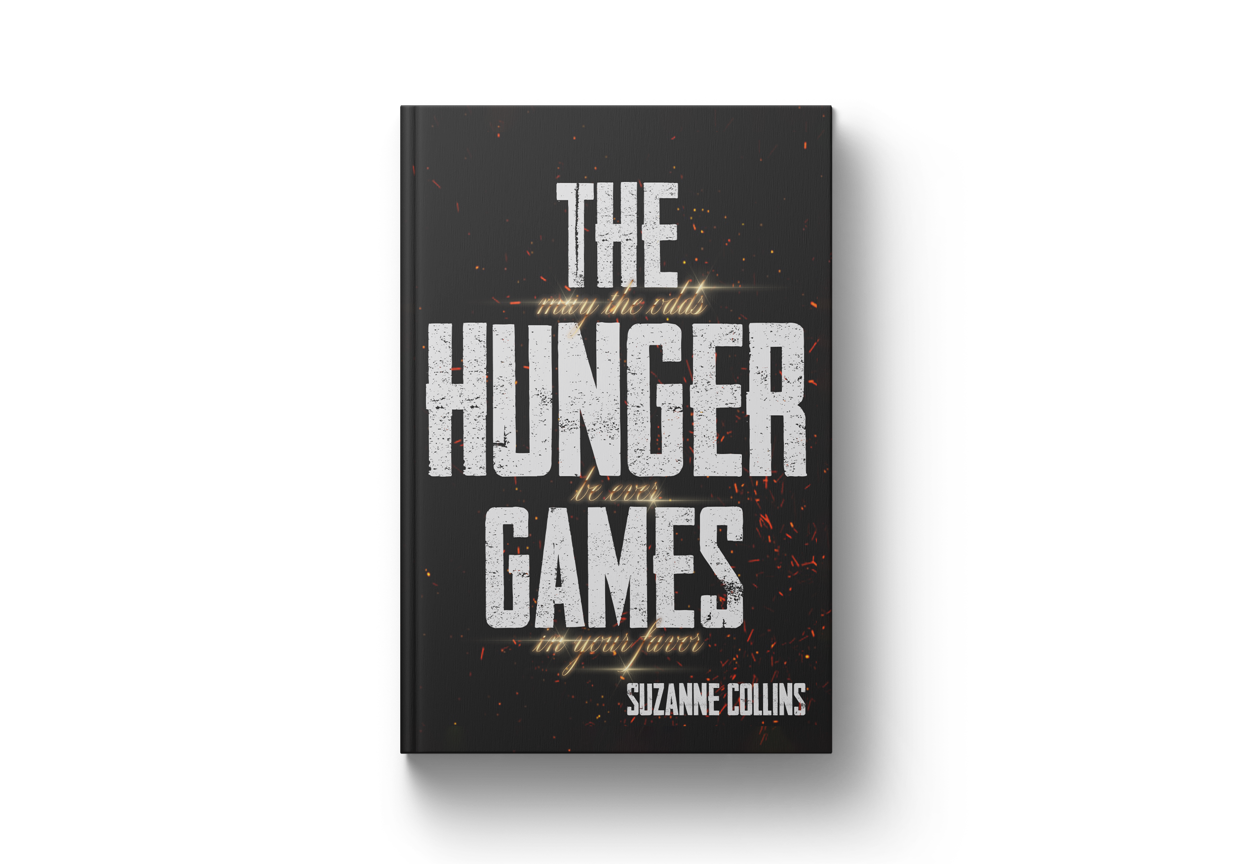
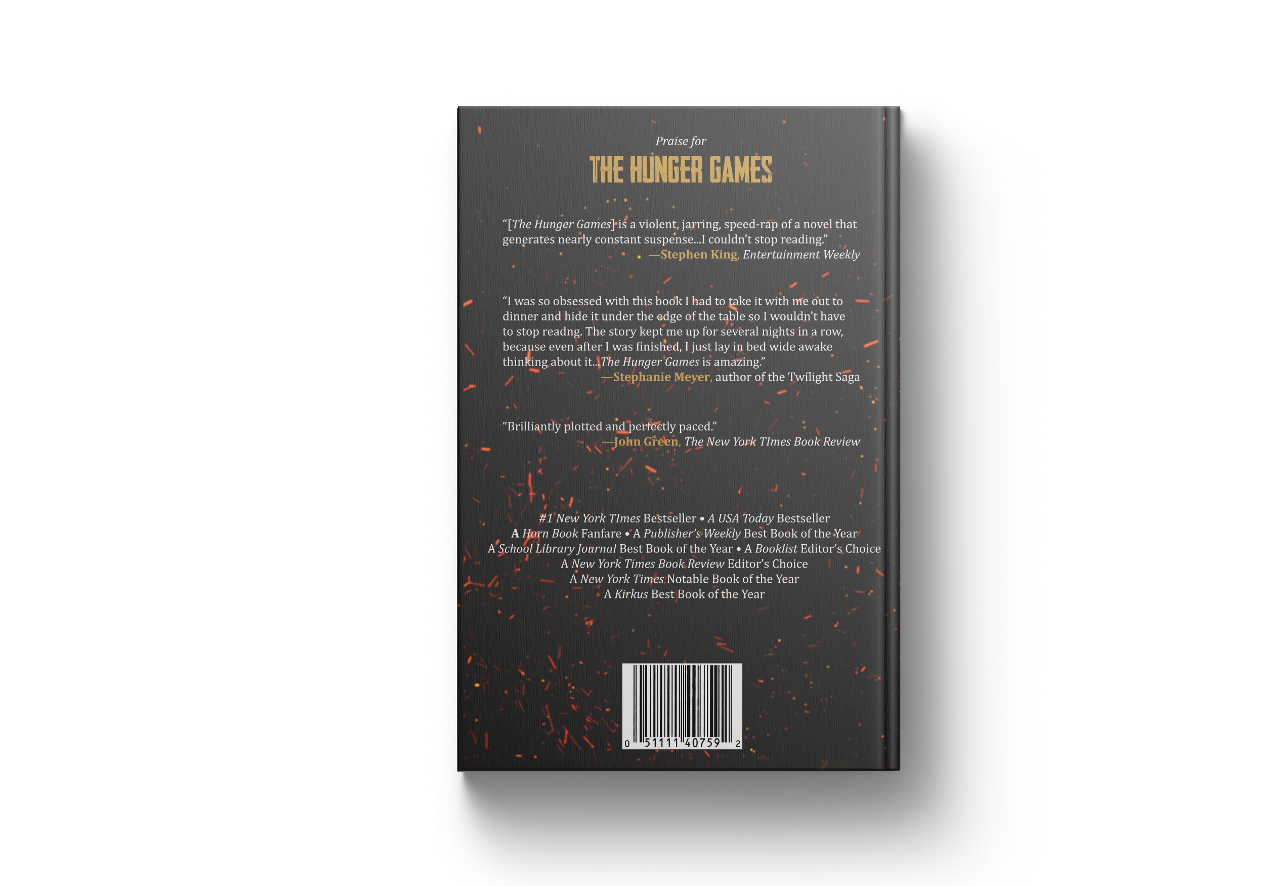
The Hardcover.
For the hardcover text-based design, I wanted the type to mirror the dichotomy between the citizens of The Capitol and the citizens of The Districts in the book. The title of the book is large, bold, and grungy to represent the oppression the districts face at the hands of the Capitol, as well as their survival. In between the lines of the title is the words “may the odds be ever in your favor,” which is used by those in the capitol to wish the competitors good luck in the games. The type is in a delicate, glinting, chromatic script to represent the luxury and safety those in the capitol experience, far removed and unaware of the hardships faced by those in the districts.
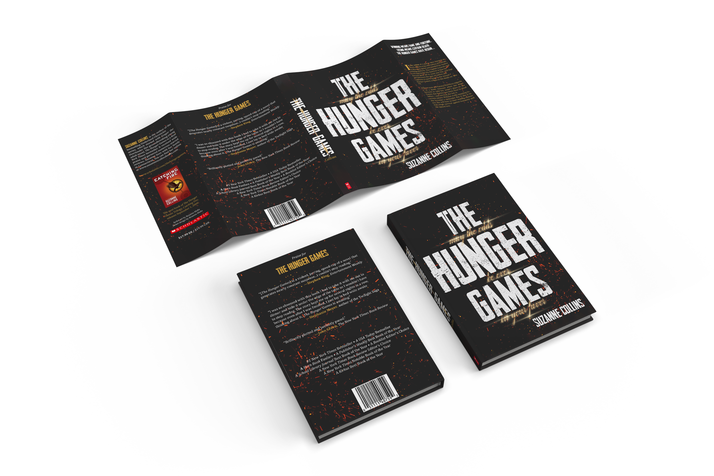
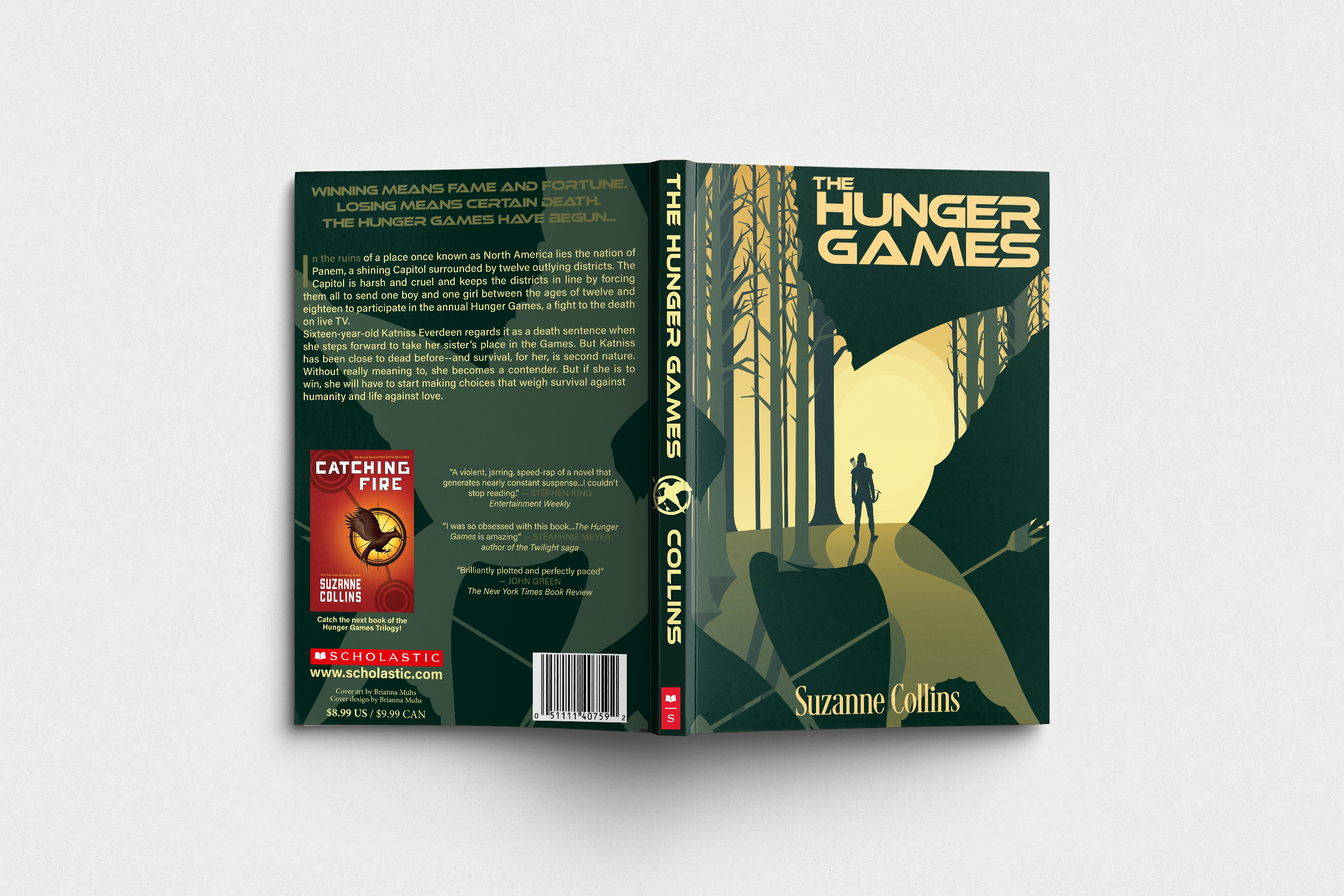
The Paperback.
For the paperback image-based design, I created an illustration of Katniss Everdeen, the protagonist, hunting in the forest of her home district. She’s looking off into a setting sun at the center of the cover, drawing the viewer in, as warm yellows radiate out giving a sense of hope and endurance in hardships. The mockingjay symbol surrounds Katniss, foreshadowing her inevitable role in the rebellion.